IDENTITY REBRAND
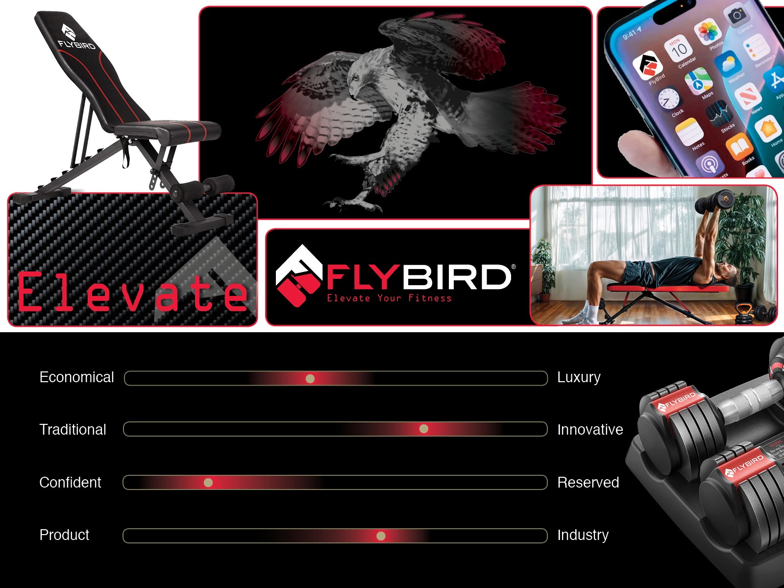
I designed the FLYBIRD Fitness identity brand refresh as a personal project. I was the client and the designer and was given zero feedback and direction. For months, I stared at this logo and there are reasons why this logo does not communicate the brand effectively. FLYBIRD is a premium brand of workout equipment; however, the current logo is cartoony and ill balanced.
While the current logo has logic utilizing the bird element that represents an incline bench and the weight acting as the head for a loosely figurative concept, it doesn’t work for a premium brand. And it took me a while to see this, proving that it is not an effective logo. The hierarchy is a competition between the word and the bird icon. It feels disjointed with the chunky type and the bird is redundantly inclusive for brand name.
THE THOUGHT PROCESS OF THE REDESIGN
When enough is enough in terms of the creation of brand identity? What is that stopping point? I thought the last versions was the answer, but it wasn’t over.
CONCEPTUAL IDENTITY LOGOS

Below is the revelation for the FLYBIRD identity.
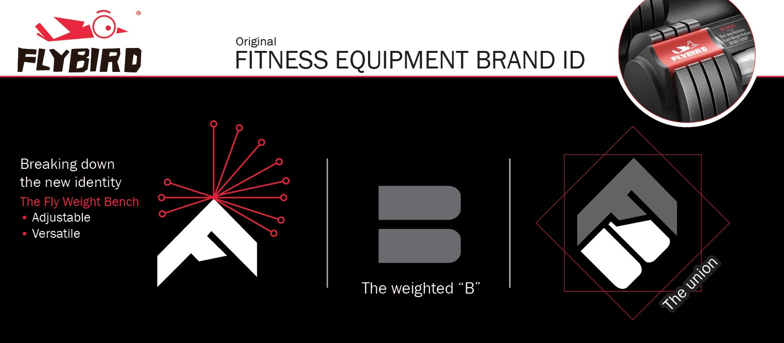
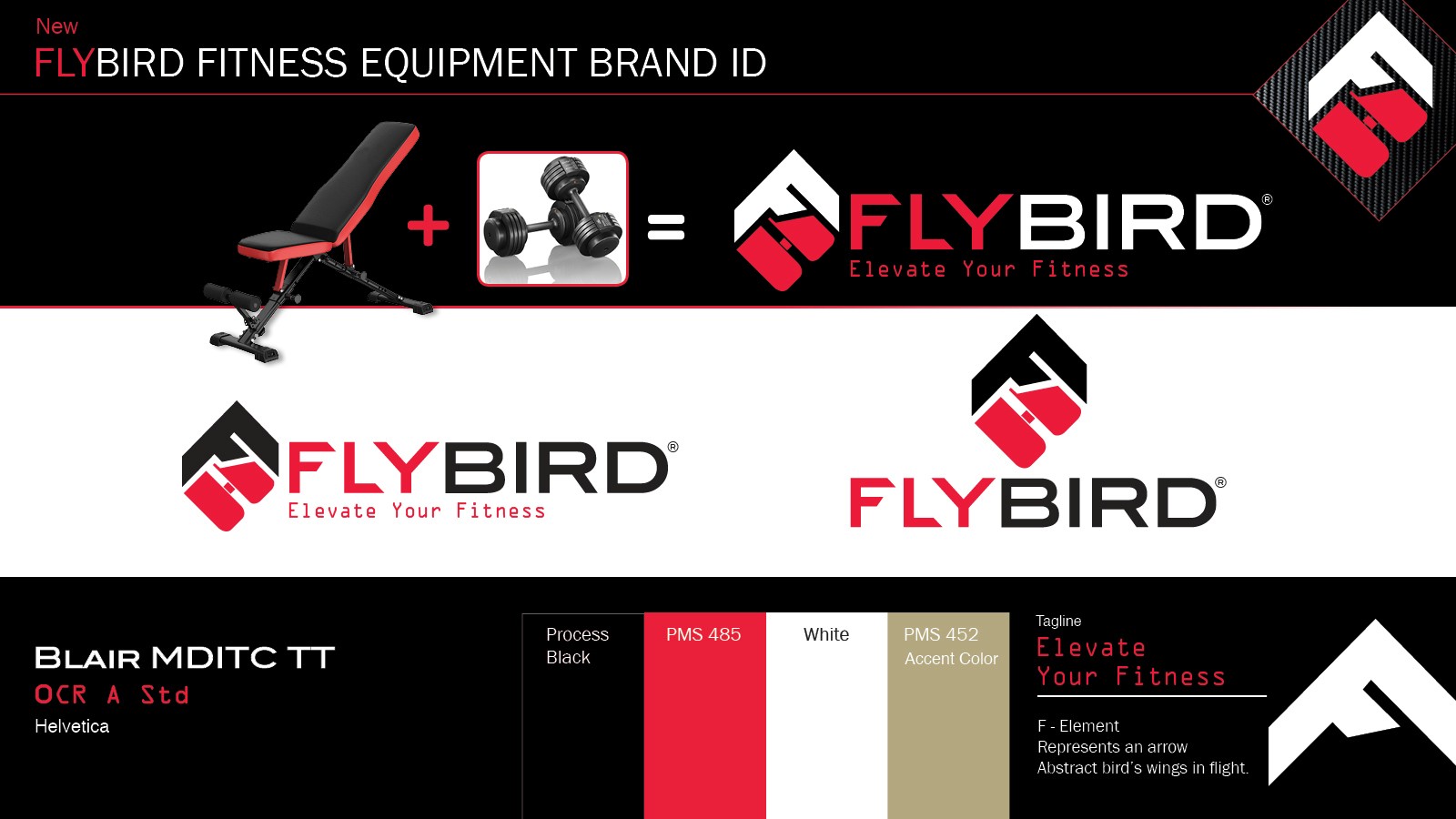
The identity reinvented is clean, strong, high-end and professionally styled, visually describing the story of who the brand is. A departure from the bird, using the F and B as the main element creating modern stand-alone icon. The “F rotated represents has two symbols; a bench and upward arrow. The B using two shapes to create this form representing a dumbbell. The entire rotation of the icon visually explains versatility and adjustability. Strength of the word mark is sharp, clean, and a bold two tone highlights word. Angular tapered ends for the F and L characters repeats the style of the “F” in the icon. Finally, the tagline, “Elevate your Fitness”, strongly wraps up the message for this branding story and further supports the incorporated arrow element for the F” rotated in the upward direction.
Regarding supportive imagery, I introduced a hybrid illustrated mixed media monotone red tail hawk in flight and accented in red. The gold PMS utilized as the accent color showcasing, “The Gold standard in fitness.”